The same SEO, UX and CRO concepts we use to help users find the correct product on a website apply to retail locations and in-store experiences.
These include internal linking, cross-selling and upselling, regional searches and volumes, filtering and trust builders.
Using these skills and the information below, you may be able to help retail locations increase their AOV, how many customers shop per day and an increase in items per purchase.
And some of these concepts can be reverse-engineered into more online success.
Falling short: When in-store service fails
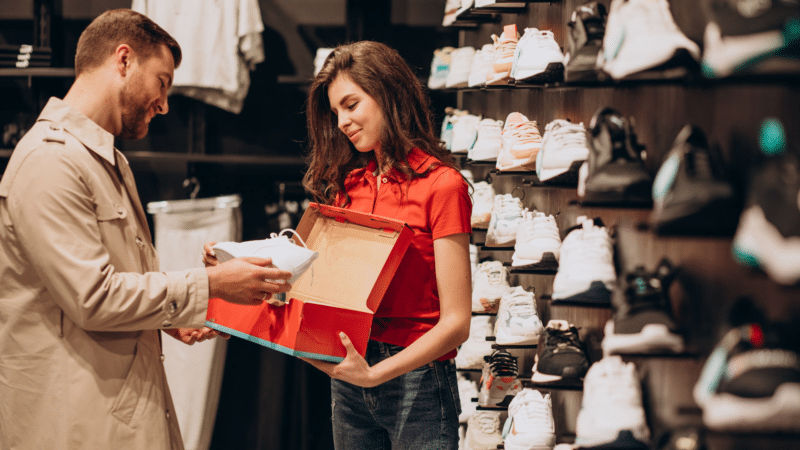
I’ve wanted to try Nike running shoes for a few years, as they have the best designs and color schemes.
This summer, I went to the local Nike store thrice, and I could not get someone to help me each time.
I tried to figure out which shoes work for my feet but couldn’t, and their website didn’t answer my questions, so I could not shop online.
Bridging online and offline: A three-step process
There’s a three-step process here for running shoes.
- Define the buyer persona and then modify it to other large target groups.
- See what is available in the store to help people find what they’re looking for.
- Apply the solutions in an easy-to-absorb format.
My buyer persona is:
- Needs arch support.
- Runs 4–7 miles, five days a week on roads, not trails or track.
- Pronates.
- Also uses shoes for standing and walking.
- Not needed for sports or speed.
What is available in the store:
There are stunning branding photos and signage everywhere in the store, but it is all to build a brand and inspire, not help the consumer make a purchase.
The products in the store (at least the running shorts) do not match the names or signage of the products on the website.
This is where SEO, CRO and UX work come into play.
How to make the retail experience better
Place the information where it’s needed
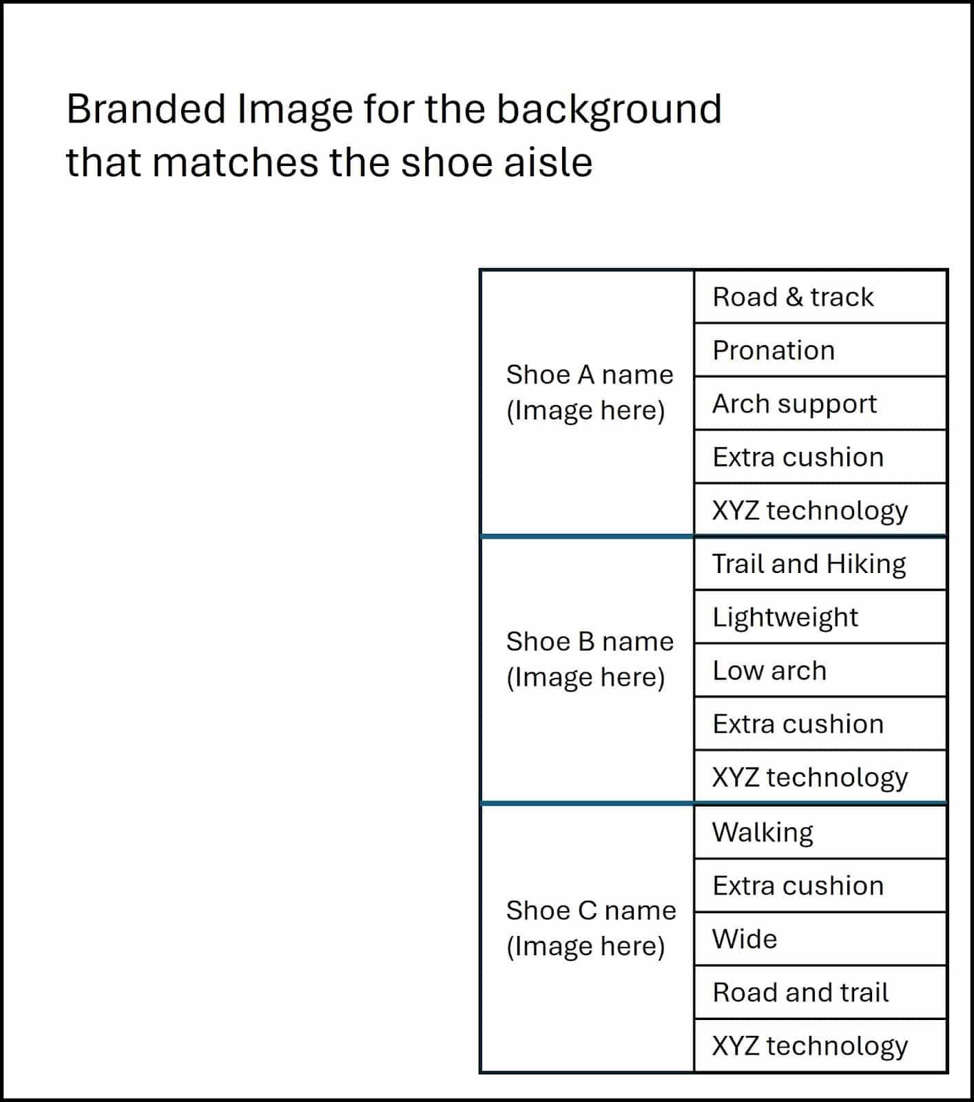
On each aisle, they can place a sheet of paper or sign showing which styles or brands are for what type of user. On the end caps of the running aisles, they could post a sheet like the image below.
Each label would be easy to replace as the seasons or lines change and can highlight the technology in the shoe that matches the aisle.
For example, one aisle would be for running shoes, another for walking and hiking, another for cleats and sports, etc.
For the running aisle, they could do a branded image with a runner. The tables would be the shoe names with a photo of them and the selling points about who it is for.

This applies to all sporting goods lines and clothing types, too.
- Cleats could show the name and list the sports they are for.
- Sneakers can help someone who needs to stand for a long time instead of walking a long distance.
- Fitness shirts could mention wicking, marathons and long runs instead of casual wear or tennis, etc.
Now, let’s “jump” into a different topic so you can apply this to your business. The same concept works for party supply stores and costume shops.
Expanding the concept: Party store and retailer optimizations
This section focuses on using internal linking, mini carts and “People also purchased” features for retailers like Party City, Spirit Halloween and Swoozies.
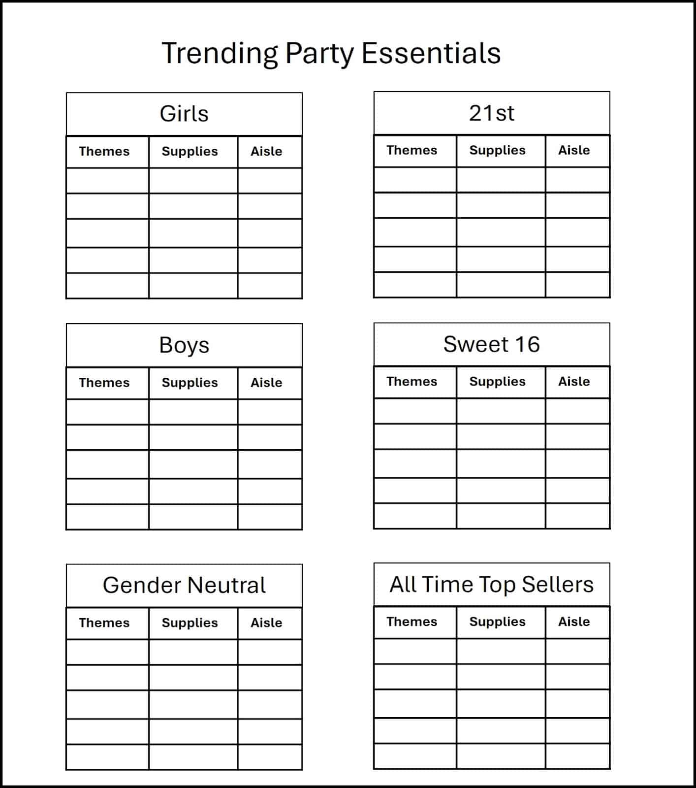
The goal is to display a chart at the store entrance showing popular or trending products and themes. Another option is to have printed charts in relevant sections or aisles to guide customers.
UX and CRO bonus: If the person is shy and shopping for a bachelorette or divorce party, this will save them from feeling embarrassed so they can shop privately. This is similar to how we would place “ships anonymously” for stores that sell embarrassing items.
The sheet can be divided into themes like birthdays, bachelorette parties, bridal or baby showers and religious events like bat mitzvahs and baptisms.
Place them in the relevant aisles or sections of the store.
You can also provide individual printouts at the entrance for customers to take while shopping.

In the mini cart on your website, you expose consumers to complementary products they may not have known existed.
The printouts here show the same and tell the user exactly where it exists.
Don’t forget to include a tiny image of the product, as this helps them visualize it.
Trending themes may inspire the consumer who isn’t sure what to do, similar to someone searching for “best party themes for a 6-year-old birthday.”
The goal is to raise awareness of upsells and get customers to add them to their carts.
This strategy also converts browsers into buyers because you’re solving their problems by identifying the best themes.
When you include the top-selling products by theme, you drive exposure to increase AOV and total items per purchase as they now see more ways to make the party better.
- Tip: If there is an increase in specific items by location, the retail teams could report this back to the web team, and the web team can use personalization to ping the IP address and recommend the top-selling upsells and cross-sells so it works both ways.
In-store internal linking and site structure
Showing the top-selling products by theme or occasion is the same concept as internal links and site structure.
You’re taking the person to a specific collection or product, just like linking a main category to a specific subcategory or a keyword phrase in a blog post to a product page.
You’re bringing the person directly to the solution so they can either learn more or find the desired product faster.
The goal is to help the user find the solution as quickly as possible and discover new pages or products they may not have known about but are relevant to their situation.
Digital concepts in various retail settings
There’s no shortage of ways to apply your digital marketing skills to retail shopping and merchandising.
It’s a matter of going to a store to buy something and being unable to find a solution without the help of an employee.
Employees are important, and so is getting a customer a solution without waiting until one frees up.
Think about a trip to the hardware store. From air filters to water tanks, if they had a comparison between them or examples we give on our websites, they could convert more customers without making them wait for an associate to help.
The customer would have a better in-store experience and may return to that location vs. shopping elsewhere because you made shopping easy.
If you’re eco-conscious, place a tablet at the beginning of each aisle to allow users to see comparisons, find compatibility information and have FAQs.
Now, the consumer can access all the information needed, like which laptop computer is best for work travel. They can even request that the laptop be brought to them on the tablet since expensive electronics are usually locked up.
This gets them the solution and product in hand like a food runner helping a server while the team members are busy helping others.
We apply these digital concepts to our retail clients and sometimes include retail strategies, such as the words customers use more frequently in-store, in our website nomenclature.
from Search Engine Land https://ift.tt/DS4mbes
via IFTTT
No comments:
Post a Comment