
Google’s Core Web Vitals have been a ranking signal since 2021 when Google introduced three metrics to measure the quality of user experiences on a website.
Real user monitoring data can tell you how well you do on Core Web Vitals and what you can do to improve them. This applies especially to the new Interaction to Next Paint (INP) metric that becomes one of the Core Web Vitals on March 12, 2024.
What’s the difference between lab data and real user data?
When measuring web performance, we can look at either lab data (also called synthetic data) or real user data (also called field data).
Lab data is collected in a controlled test environment. It tells you how fast your website loads from a given test location, with a given network connection and a specific test device. That makes it very consistent between tests, and the reporting can be very detailed as testing tools have full control over the test environment. Lighthouse is an example of a synthetic testing tool.
In contrast, real user data is collected from visitors when they go to your website. Each visitor will have a different experience depending on where they are located, how fast their internet connection is and what kind of device they are using. So when looking at a metric we need to look at a statistical average like the 75th percentile that is commonly used when reporting Core Web Vitals data.
You’ll often see that the metric values don’t match between lab and field data. Ultimately what you care about is real user experience, but synthetic data can provide a lot more depth to help you understand and improve your page speed.
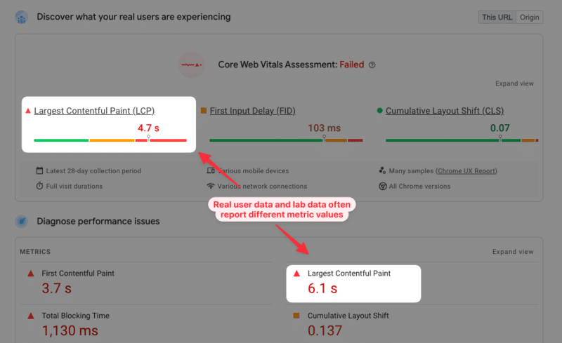
Why is real user data important to improve your Core Web Vitals?
Running a lab-based page speed test is great to analyze the initial load speed of your website. But other metrics depend on how users interact with the page once it’s been opened.
This applies especially to the new Interaction to Next Paint metric. Your INP score depends on what page elements users are interacting with, and at what point during the page load process these interactions happen.
While Cumulative Layout Shift (CLS) may occur during the initial page load, it often happens in response to a user interaction or when scrolling down a page. If you only collect data in a synthetic environment, you’ll miss these layout shifts that happen later on in the lifetime of a website visit.
How to collect real user Core Web Vitals data
A real user monitoring (RUM) solution like DebugBear can help you collect Core Web Vitals data on your visitors. You set up an analytics snippet on your website and this data is then aggregated and shown in a Core Web Vitals dashboard.
You can see whether any of your most visited pages are slow and how user experience varies based on the location of your visitors.

How to decide what pages to optimize
To begin with, check if any of your most popular pages are failing the Core Web Vitals assessment. You can also use Google Search Console to identify pages with poor user experience on your website.
Once you’ve identified a page you can dive more deeply into analyzing your RUM data and finding ways to improve.
Improve Largest Contentful Paint with real user data
Real user monitoring data for a page can help you understand the impact various performance optimizations would have.
LCP Optimization Potential analysis shows what you need to optimize to improve LCP:
- Time to First Byte (TTFB): This component looks at how quickly the server responds to the HTML request.
- First Contentful Paint (FCP): This tells you whether there are render-blocking resources that prevent page content from appearing.
- LCP: This shows how long it takes for the LCP element to show up after the page first renders
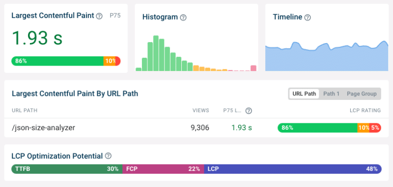
See what page elements are responsible for the Largest Contentful Paint
Different visitors viewing the same page will see different content when the page first loads. The largest content element varies between desktop and mobile users and between logged-in and logged-out users.
Analyzing what page elements most often end up as the LCP element helps you understand what optimizations will help the largest number of users. It also lets you see if there are some LCP elements that result in particularly poor LCP scores.

Reduce render-blocking resources
If the First Contentful Paint component contributes a significant amount of time to your LCP score you need to see what can be done to make your website render earlier.
Tools like DebugBear and others tell you what the last render-blocking request is for each page view. If you load this resource more quickly then the First Contentful Paint will happen sooner.
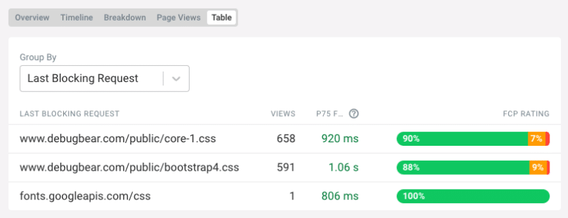
Optimize LCP Images
The LCP Element breakdown tells us what type of element is responsible for the LCP for different users. Here the analysis shows us that a background image is responsible for the Largest Contentful Paint 96% of the time. That means we should focus on loading that image more quickly.
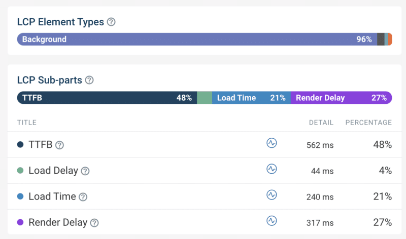
The LCP sub-parts breakdown helps us optimize image loading performance by looking at components that follow the TTFB:
- Load Delay: How quickly after loading the HTML document does the browser start loading the image?
- Load Time: How long does it take to download the image?
- Render Delay: Does the browser show the image immediately after loading it or is there a delay?
In this case we can see that we need to optimize Load Time, for example by reducing download size with a more modern image format. The image also often finishes loading before the First Contentful Paint, which means it remains hidden for a few hundred milliseconds.
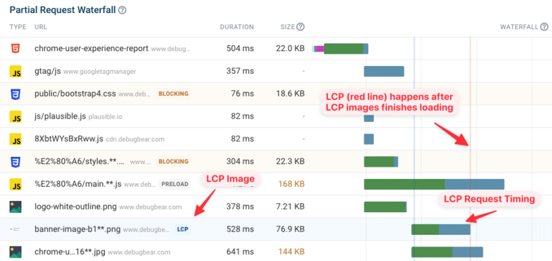
Looking at a specific page view and investigating the request waterfall visualization can help you better understand in what order different resources are loaded and how long a given request takes.
For example, here we can see what request loads the LCP image, when that request starts, and how soon after the request the LCP is recorded. Here we can see that the LCP (indicated by the red line on the right) happens right after the LCP image is loaded, which means that there is no Render Delay for this page view.
Improve Interaction to Next Paint with real user data
The INP score of your website greatly depends on what page elements users are interacting with. Clicking somewhere on a paragraph usually doesn’t trigger any code to run, and those interactions will be fast. A menu toggle or button that generates a new UI component and displays it will take a lot more time.
With real user data you can see what elements users are interacting with most often, and which of these interactions are slow.

Identifying code that’s causing slow interactions
You can also see what scripts are responsible for slow interactions. JavaScript files may be part of your own website code or part of a third-party service like, whether that’s a chat widget or newsletter popup.
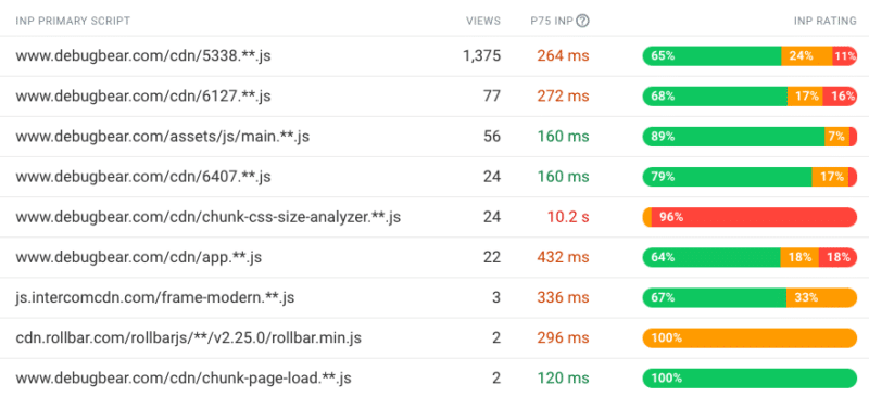
This is possible thanks to the new Long Animation Frames API that will be included in Chrome from mid-March 2023. This browser functionality reports what code is causing rendering delays on a page.
When you look at an individual user experience you can see what element the user interacted with and what code ran at that point, causing poor INP.

Once you’ve identified a specific script file you can then check whether that script is necessary and if there are ways to make it run faster.
When do slow interactions happen on the page?
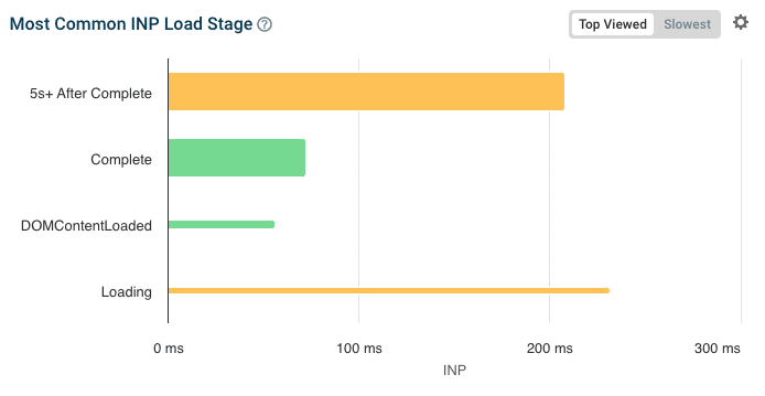
Another factor that impacts INP is the page loading stage when the interaction happens. During the very early loading stages INP is often high, as many parts of the page are initialized which requires a lot of CPU processing.
If that’s the case, you can consider different ways to optimize the initial page load logic and if more room can be left for handling user interactions during this time.
The width of the bars in this chart indicates how many users encounter poor INP at each loading stage. So, while the early “Loading” stage causes poor INP, not that many users are actually impacted here.
Improve Cumulative Layout Shift with real user data
Since layout shifts often occur following a user interaction, real user data makes it easy to identify shifts that you can’t detect in a lab-based test.
You can see what elements shift around and what user interaction led up to the layout shift. For example, an image that appears in response to a button click may push down other content on the page when the image has finished downloading.

What’s the difference between real user monitoring (RUM) and Google CrUX data?
You can use Google’s Chrome User Experience Report (CrUX) to obtain real user Core Web Vitals data for your website, without having to do any setup work.
However, real user monitoring addresses several limitations of the CrUX data:
- Regressions and improvements show up instantly with RUM data, while CrUX data is aggregated over a 28-day period.
- CrUX data is only available for high-traffic pages, while RUM data is available for any page on your website that a visitor views.
- The CrUX data only provides metric values and no debug data. You can see where your website is struggling on the Core Web Vitals but won’t know what to do about it.
Real user monitoring shows you how users are experiencing your website and what impact it has on their behavior.

Get started with real user Core Web Vitals monitoring
Looking to improve your web vitals, rank higher in Google, and deliver a better user experience? DebugBear offers a 14-day free trial – sign up now to get the data you need to optimize your website!
from Search Engine Land https://ift.tt/G96QEHh
via IFTTT
No comments:
Post a Comment